Enghouse Design System
Summary
Enghouse operates as a diverse portfolio of both acquired and internally developed products. This mix resulted in a fragmented ecosystem where each product had its own distinct style, user interface, and interaction patterns.
As the Director of UX, my role was to address this disparity by spearheading efforts to unify the design language across all products.
The task was not merely cosmetic but required a deep understanding of each product’s unique identity and functionality, combined with a vision for how they could integrate seamlessly into a unified ecosystem.
Goals and challenges
Build a UI design system for product and engineering teams to follow.
Create a glossary of commonly used terms in products
Create a catalog of complex components (Ex: Sign in flows)
Phase One
When I had come on board the team at Enghouse, initial planning and setup of a design system had begun. Led by engineering, the direction was to use Material UI as a front-end Design Component framework, with ReactJS. The goal was to have various products transition to using this front-end stack for their products.
Road blocks
It was easy for new products being developed to go this route, but we quickly learned that this isn’t an easy transition to make for an existing application. A product rewriting it’s front-end code to adhere to a design system. The cost, time and effort just wasn’t worth it.
Phase Two - Going “frame-work agnostic”.
At the end of 2023, I decided it was time for a new strategy. The goal of having the various products in the company having a consistent visual identity and consistent user experience for common components wasn’t happening with the existing plan.
The new plan was to go frame-work agnostic. To not be limited by a technical stack. There were to big benefits to this. First, it would easy for any product using any front-end frame work to restyle the UI components to look like the Design System. Second, it order to rapidly evolve, we would be technical restrictions on growing.
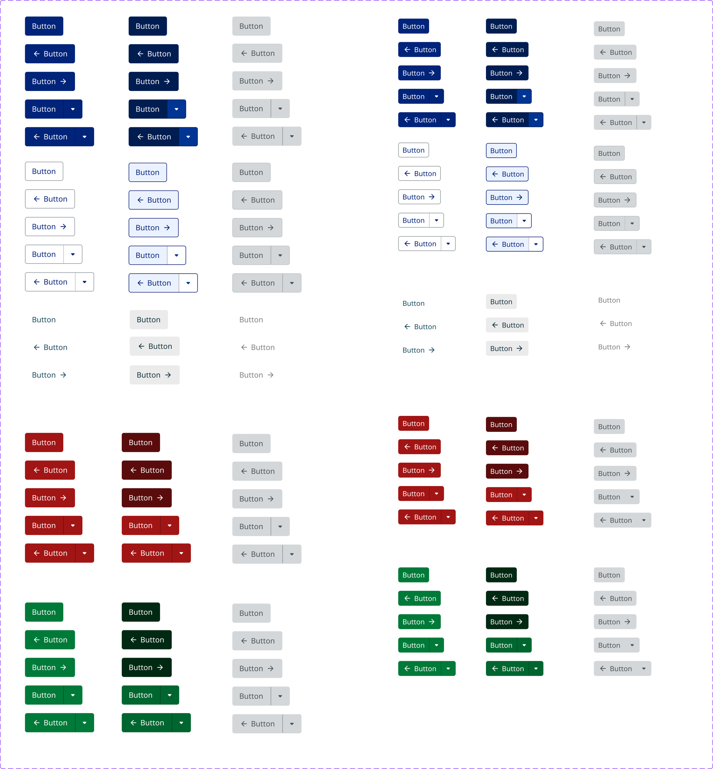
As a result of this the UX team design a library in Figma unbound by any framework. For example, a button would be some core styles and behavioural guidelines. This would be easy enough to implement for any team. We established spacing rules, UI components, grids, and accessibility behaviours for the new system.


Documenting themes and components
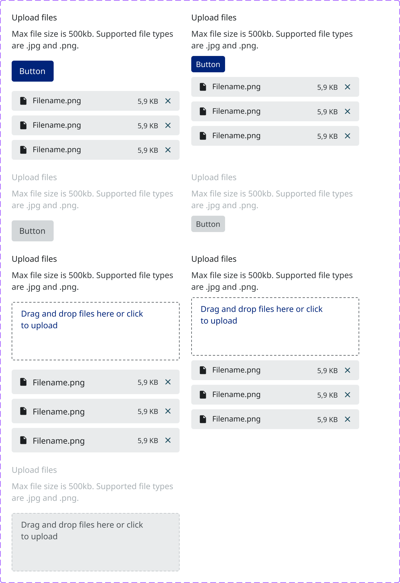
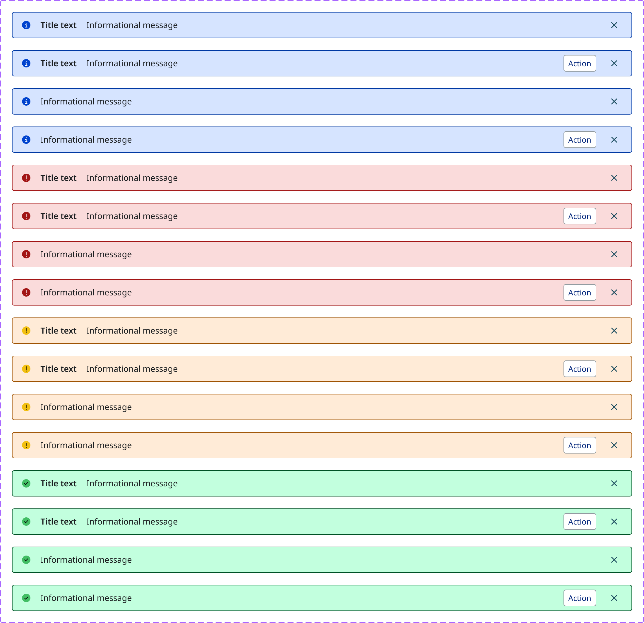
Once the UI system was setup, for the second step the team has begun to document common UX behaviour and UI components, like Sign-in forms, Headers, Navigation etc.
A few components have been documented to begin with, and more planned for the coming year in 2025.
Progress and outcomes
The overall feedback has been hugely positive as it’s easier for products and engineering to teams to follow these guidelines and implement these standards.


